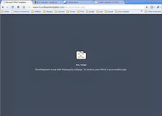
How to Design an Informative Error Page
A 404 page is very important, though it doesn't seem so, considering the fact it's the less viewed part of a website. The idea that this page is what has to help lost users makes it necessary to take into account and not ignore its importance but rather make the best use of it. It's very disturbing to search for something on the Internet and reach an error page. Error pages are usually quite unpleasant, annoying and absolutely useless, unless they are created in an entertaining or informative way. It's more than possible to design a nice error page and not only keep users on your website, but also makes them love it. An error page can be informative and super helpful allowing visitors to learn what goes wrong. Here are tips on how to create an error page that will put misguided users back in track, without leaving your website.
A Good And A Bad Error Page
404 pages can be either good or bad and the difference is significant. A bad error page would show no interest to users who've ended up on it. It will most likely display a 'Sorry, you're looking for something that's not here' message, which is totally useless, and basically that is all you'll get on that page. On the other hand, a good error page would provide visitors with full information and help them to find their way back on the website. It's really up to you what kind of a 404 page you'd like to have, most probably a good one.
YOU MAY LIKE: About To Launch A Website? Here's The Vital Preparation You MUST Do First
Make It Helpful
There are several ways you can create a helpful and informative error page.
The first thing you can do to make a useful error page is to include a search box. It's quite an obvious thing to do, but yet a very essential part of a good 404 page. You can't expect that what visitors of your website are looking for can be easily found. Therefore you should include a search box that allows them to search in depth.
Another important feature an error page should possess is contact information and an option to subscribe. These two things are more effective than you can imagine. These are ways to get visitors more engaged with your website. It gives a good feeling when users have the possibility to contact you in case they need help or more information. Whether you put a direct link to your contact page or a contact form on the error page itself, it will definitely make a good impression and show your concern.
READ: How to Jump Start Traffic in 4 Simple Ways
To make your error page more interesting, you can add personality to it. Make it funny and entertaining and this will surely keep visitors on the website and not angrily leaving it.
You can also add a link to the homepage of your website. Let visitors get back from where they've started by directing them to the real content.
Another thing you can add is a link to recent or popular posts. This gives users the opportunity to get involved with something they were not looking for and actually be interested in. You can add recent posts with or without a plug-in. Either way it will do the job and keep visitors on the page.
ALSO READ: How To Set Up A Website To Boost Your Business
You don't want visitors of your website to close it with the speed of light at the moment they reach an error page. Make this page useful and interesting and not only they won't leave, they will like it and remember it.
Author Bio:
Rose Finchley is a freelance web designer. Her last works is http://www.fasthomecleaning.co.uk/ and you can learn a lot from her.


0 comments:
Post a Comment
We love comments and questions, but please DON'T SPAM. Make sure your comment is related to this post.